
Menu
Designing a booking room experience: streamlined, intuitive, and aligned with internal workflow.
Helping employees find, reserve, and manage meeting rooms seamlessly, supporting better organization, clearer scheduling, and improved team coordination within the company.
Context
This project was developed as part of a whiteboard challenge during a UX Bootcamp in February 2025, using an AI-generated prompt to simulate a real-world business problem. Acting as a Product Designer, I independently created a functional solution to improve meeting room usage in a fictional company. The goal was to demonstrate strategic thinking, problem-solving, and clear communication of design decisions.
Role
Product Designer
Duration
2 months
Team
Solo Designer
Tools
Figma, FigJam, Claude.ai, ChatGPT
Problem Space
The company struggled with inefficient meeting room usage due to an unstructured, first-come-first-served system. Issues like small teams occupying large rooms and peak-hour bottlenecks led to delays and reduced productivity. The goal was to design a smarter digital solution to centralize bookings, improve room visibility, and optimize usage.
Solution
A minimalist iOS app was designed to streamline room bookings through smart matching, timed check-ins, and Google Calendar integration. With real-time status indicators and automated room release, the system ensures efficient use and easy scheduling via a simple, intuitive interface.
Impact
By implementing the Smart Room Matching app, the company would benefit from increased operational efficiency, improved resource allocation, and a more seamless meeting experience. Users would save time and avoid frustration through real-time room availability, smart matching based on group size, and a simple check-in flow that minimizes no-shows. On an organizational level, the app enables better planning, reduces room conflicts, and supports more productive collaboration by ensuring that meeting spaces are used effectively and fairly.
Step One
Auditing the Experience
Designing this solution emphasized the balance between automation and user control. The smart matching system streamlined booking, while the check-in flow ensured accountability. A key challenge was keeping the interface intuitive despite complex logic. Working with AI-generated assumptions required strong critical thinking to simulate realistic scenarios. This project showed that minimal, focused interfaces can address real operational issues when built on thoughtful logic and behavioral insight.
Challenge
The biggest challenge was designing without real users or stakeholders, relying on AI interviews and assumptions to simulate realistic behavior and prioritize features. Balancing simplicity with complex organizational needs like no-shows and room misuse while considering business constraints required critical thinking and strategic trade-offs.
Step Two
Step Two: Research and Insights
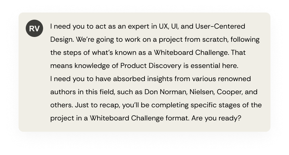
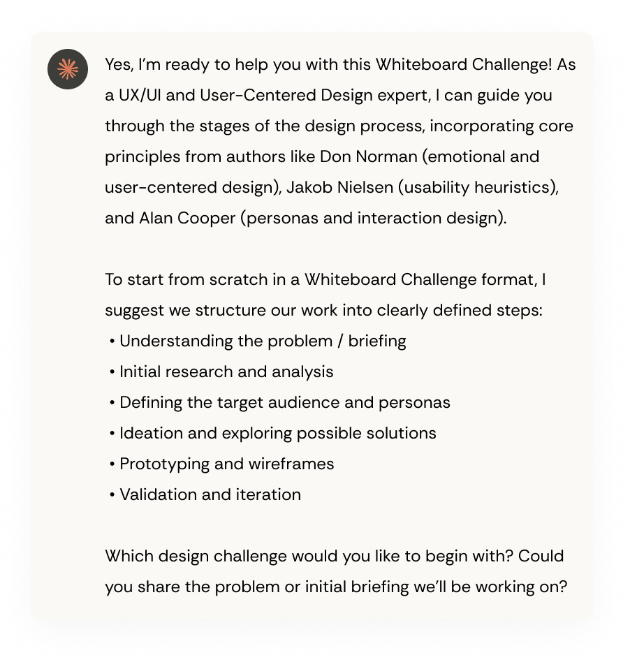
To deeply understand the context and shape an efficient solution, I conducted a structured analysis of the challenge proposed by the bootcamp challenge and request to the Claude.ai to generate assumption mappings, information that a real company would typically provide during a discovery phase.
These assumptions revealed key patterns: a mismatch between room size and actual usage, and frequent last-minute bookings or forgotten cancellations. Additionally, users strongly preferred a fast and intuitive experience, especially during peak hours.
I focused on the company’s specific needs, like room policies, real-time check-ins, and ease of use without training. The solution was tailored to its infrastructure and booking habits, leading to key features such as smart room matching and a simple check-in/no-show system to boost usability and adoption.
Proto-Persona 1
The Team Lead
Agility and practicality for short, frequent team meetings, often scheduled on the go. Needs tools that don’t interrupt their workflow.
Motivation
Wants to keep the team aligned and productive with minimal friction, valuing time efficiency and collaborative momentum.
Behavior
Books small rooms multiple times a week. Prefers tools that require little to no learning curve and allow quick rebooking.
Pain Points
Frequently experiences frustration when small groups misuse large rooms during peak hours, and inconsistent adoption of tools.
Design Consideration
Smart room suggestions based on usage habits and team size, alongside a quick and intuitive booking flow, and mobile-first experience.
Proto-Persona 2
The Busy Manager
Clarity and coordination are key for managing multiple cross-functional meetings. Needs visibility and tools that ensure everyone is aligned on space usage.
Motivation
Save time and avoid meeting delays by relying on tools that are efficient, clear, user-friendly, and require minimal effort to use.
Behavior
Frequently forgets or skips meetings because there’s no clear check-in system in place, and it’s easy to lose track of room details or meeting locations.
Pain Points
Often feels lost using current tools and misses system emails or sees them too late, which leads to unexpected cancellations and last-minute rebooking stress.
Design Consideration
Needs clear visual feedback and timely reminders to avoid no-shows and make room booking simpler and more reliable.
Step Three
Ideation
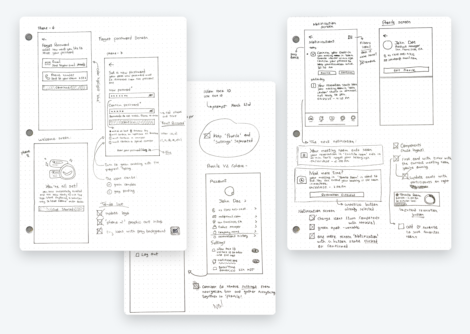
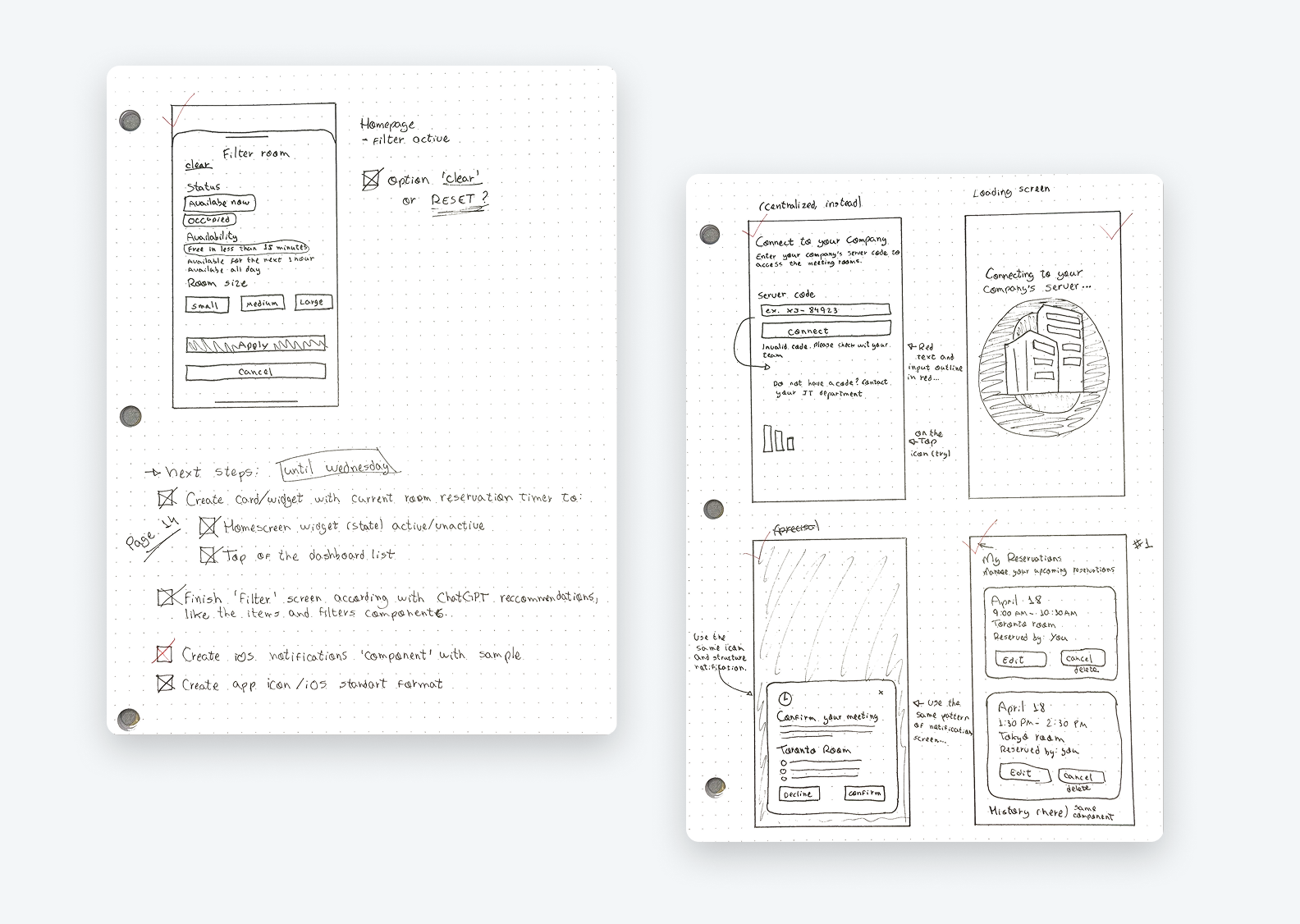
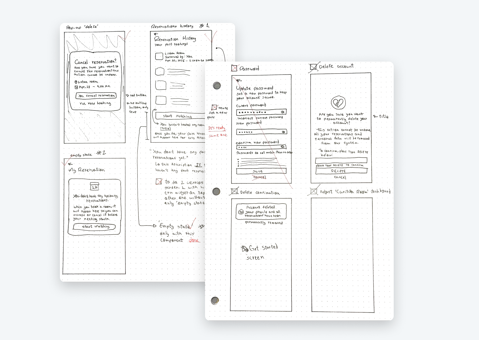
With clearly mapped assumptions and user needs in mind, I explored several ideas to solve key pain points like last-minute bookings, no-shows, and inefficient room usage. I focused on building a Minimalist iOS App with Smart Matching, designed to be fast, intuitive, and easy to adopt by busy professionals.
Ideation Included
Throughout this phase, the balance between simplicity and effectiveness guided every design decision. Features were prioritized based on business impact, user effort, and feasibility, ensuring a scalable and realistic solution for the company’s specific environment.
Step Four
Business Logic Behind the Solution
To ensure efficiency, clarity, and optimal use of the company’s physical spaces, the app operates based on conditional logic rules. The system checks room availability in real time and determines what status to display to employees, based on the current time, upcoming bookings, and internal company policies.
Booking Available All Day
The room has no scheduled meetings and is fully available.
Booking Available Until [time]
The room is available now, but there’s a meeting scheduled later today.
Meeting Starting at [time]
The room is available, but a meeting is starting within the next 30 minutes.
Meeting Ending at [time]
The room is currently in use but will become available in the next 30 minutes.
Next Available at [time]
The room is occupied and won’t be available again for at least 30 minutes.
Blocked for Maintenance
The room is temporarily unavailable due to cleaning or maintenance.
In addition to status updates, the system follows specific rules to keep things organized and efficient:
This logic-driven approach creates an intuitive interface that reflects the reality of a hybrid work environment, combining tech, business rules, and user experience in one seamless system.
Step Five
Handoff
Documented design decisions, product, user flows, and UI specs to ensure a smooth transition from design to development, promoting alignment and consistency.
Central Problem
Inefficient use of 8 meeting rooms, leading to resource waste and user frustration.
Detailed Context
Impact of the Problem
Organizational
User Experience
Operational
Project Goals
Business Assumptions
Infrastructure
Size & Distribution
Occupancy Dynamics
User Assumptions
Behaviors
Needs
Current Issues Assumptions
Technological
Organizational
Constraints Assumptions
Budgetary
Technical
Prioritization Matrix
High Impact / Low Effort (Priority 1)
Check-in/No-show System
Smart Matching
High Impact / High Effort (Priority 2)
Analytics Dashboard
Smart Booking System
Low Impact / Low Effort (Priority 3)
Usage Policy
Quick Booking
Low Impact / High Effort (Priority 4)
Gamification System
IoT Integration
Implementation Recommendations:
Phase 1 (Immediate):
Phase 2 (Mid-term):
Phase 3 (Long-term):
Hypothesis 1: Check-in & Automatic Room Release
IF we implement a mandatory check-in system within the first 5 minutes of a meeting, THEN we will reduce blocked but unused room time by 70%, BECAUSE users will be required to confirm their presence, and no-show rooms will be automatically released.
Hypothesis 2: Smart Matching
IF we develop a system that automatically suggests rooms based on the number of participants, THEN we will optimize space utilization by 80%, BECAUSE it will prevent small groups from occupying large rooms unnecessarily.
Hypothesis 3: Agile Booking System
IF we create a simplified interface with a clear view of room availability, THEN user satisfaction will increase by 60%, BECAUSE they will be able to find and book appropriate rooms more quickly.
Hypothesis 4: Smart Notifications
IF we implement an automatic notification system, THEN we will reduce scheduling conflicts by 50%, BECAUSE users will receive real-time alerts about cancellations and newly available rooms.
Hypothesis 5: Quick Release
IF we allow users to indicate when they finish meetings earlier than scheduled, THEN we will increase room availability by 40%, BECAUSE other users will be able to utilize open time slots between meetings.
Success Metrics
Suggested Next Steps
Minimalist iOS App with Check-in
Implementation Recommendation
I recommend starting with Minimalist iOS App with Check-in because:
Matching Room iOS App
Dashboard Room Status Overview
Flow
Matching Rules
Design System in Figma
Reusable components, auto layout, and variables were used to ensure consistency, scalability, and efficiency throughout the UI design process.
User Flows and Navigation
All user flows were visually mapped in FigJam to support interface decisions and cover different usage scenarios.
Final UI
High-fidelity screens were designed in Figma to reflect the final product experience and design decisions made throughout the process.
What I learned
Throughout this project, I faced a few challenges that became valuable learning opportunities. One of the biggest lessons was understanding the importance of following each design phase in the right sequence.
After completing the problem mapping and documentation, I rushed into designing the screens, skipping the user flow. Later, I realized that several edge cases hadn’t been considered, such as scenarios where no rooms are found or when a user inputs an invalid phone number. This made it clear that user flows are essential to identify all possible variables early on, ensuring a smoother and more complete user experience.
I also deepened my use of Figma features like components, variables, and auto layout, which allowed me to build a flexible and scalable UI system. These tools were especially useful in maintaining consistency across repeated elements like status tags, room cards, and buttons.
Another key lesson was the importance of starting with foundational components before diving into screen design. If I were to begin this project again, I would first create a library of reusable elements, such as buttons, input fields, and layout blocks using Figma’s component system and auto layout. By initially skipping this step, I ended up duplicating effort and making updates manually across multiple screens. This helped me realize how crucial it is to build flexible, well-structured components early on, so that future adjustments can be made easily and consistently throughout the UI.
Built with heart, not just Figma
This project was more than a portfolio piece, it was a personal milestone. It demanded attention, consistency, discipline, and a commitment to learning every single day. Bit by bit, I shaped something I’m genuinely proud of. Reaching this result made me feel fulfilled and even more motivated to keep growing, stay curious, and explore new tools and methods. As I progressed, I felt increasingly certain: this is what I want to do. This is where I found purpose and where I found myself.
Opportunities
As the project evolved, I started to identify areas for future improvement. A few opportunities include enabling users to invite and manage meeting participants directly within the app, and designing a Live Activity or Dynamic Island widget for ongoing meetings, giving users quick, real-time access to room status.
These ideas reflect my ongoing commitment to refining the experience beyond the MVP, always thinking ahead and designing for what’s next.
Participant Invitations
Allow users to invite colleagues to meetings and manage attendees within the app.
Live Meeting Widget
Integrate a real-time widget via Live Activities or Dynamic Island for quick access to meeting status during active sessions
Smart Favorites Page
Add a section for favorite rooms, with the option to manually favorite via a heart icon or let the system automatically flag frequently booked rooms.
AI-Based Calendar Insights
Leverage usage patterns and booking history to suggest optimal meeting times and preferred rooms. This AI-driven insight can help streamline scheduling, reduce conflicts, and personalize the experience for frequent users.
Feel free to connect with me on LinkedIn or drop me an email.
I’m always open to new opportunities and conversations.
Copyright © 2026 Rafael Vaz