
Menu
Designing a client‑driven photography portfolio: clear, trustworthy, and ready to convert.
Helping a Colorado Springs photographer move beyond word‑of‑mouth by creating a magazine‑inspired website that clarifies services, builds credibility, and makes it easier for new clients to discover and book sessions.
Context
This project was a real‑world engagement with a Colorado Springs photographer who wanted to move beyond word‑of‑mouth and turn photography into her primary source of income. Acting as a Product Designer, I led the end‑to‑end process—from discovery and problem framing to UX architecture, content strategy, visual design, and delivery in Framer—to create a portfolio website that feels editorial, builds trust, and makes it easier for new clients to understand her services and get in touch.
Role
Product Designer (end‑to‑end)
Duration
1 month
Team
Solo designer, collaborating directly with the client for feedback and validation.
Tools
Framer, Relume, Claude.ai, ChatGPT, Notion
Problem Statement
As a new photographer in Colorado Springs, Debora relied almost entirely on word‑of‑mouth to find clients, which limited her reach and made it hard to turn photography into a reliable source of income. She needed a portfolio website that clearly communicates her services, builds trust with potential clients, and makes it easier for people to discover her work and get in touch online.
Discovery
I started with a strategic briefing to uncover Debora’s goals, pain points, and expectations for building a portfolio that could attract clients. Acting as the main point of contact, I mapped her technical limitations, UX challenges, inspirations, and clear “no‑go’s,” while also researching the local photography market in Colorado Springs and reviewing competitor websites to clarify target audience, expectations, and decision‑making factors.
Step One
Ideation
With the problem defined, the next step was to understand how design, content, and positioning could work together to support Debora’s goals. Instead of treating this as “just a website,” I framed it as a service touchpoint: I needed to design for two layers of users at the same time—Debora, who needed a professional way to present her work, and her future clients, who needed clarity, trust, and a simple path to booking. This shift from a typical SaaS mindset to a service‑based context helped me focus on both storytelling and measurable business impact.
Sitemap
From those early ideas, I mapped the core journeys a visitor should be able to complete: discovering who Debora is, understanding what she offers, exploring real sessions, and reaching out to book. That led to a focused sitemap with five main pages: Home, About, Sessions, Portfolio, and Contact—plus a link to Instagram as a dynamic layer of social proof and recent work. To validate this structure, I used Relume.ai to visualize each section, refine the hierarchy, and review the navigation with Debora, aligning the information architecture with both her business priorities and common patterns in local photography websites.
Home
Navbar
Hero
Full‑width image that immediately shows Debora’s style and niche.
Intro
Short bio block with photo, headline, and copy about her approach.
Highlights
Curated gallery strips plus social proof (testimonials) to show real results.
CTA
Clear invitation to view sessions or get in touch.
Footer
About
Navbar
Hero
Strong portrait and concise introduction in three short paragraphs.
Fun facts
Compact section with origin, inspirations, and personal details that humanize the brand.
Gallery CTA
Visual teaser that routes users back to her work.
Footer
Sessions
Navbar
Overview
Hero section explaining how sessions work and what clients can expect.
Session Blocks
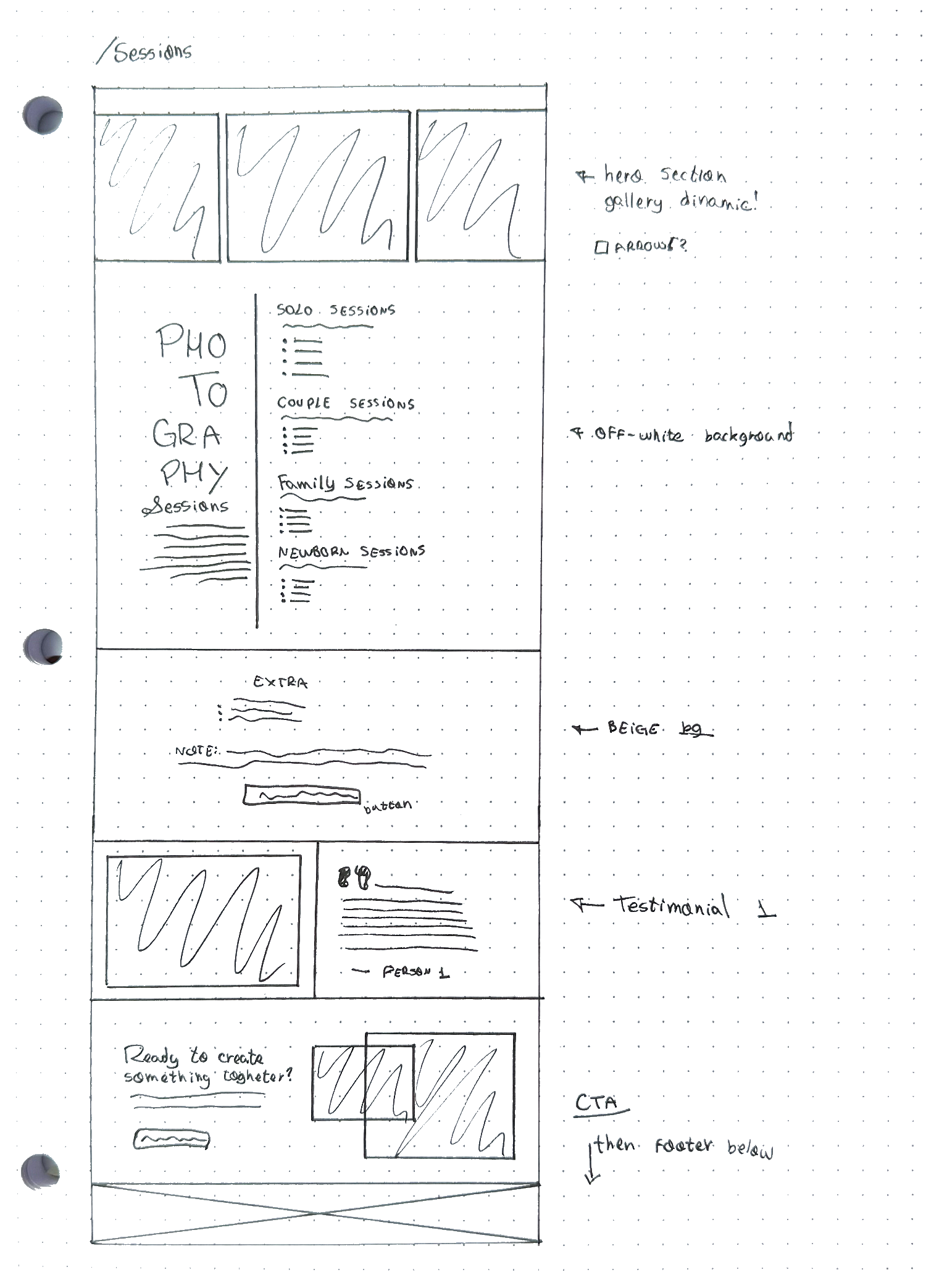
Solo, couples, family, kids, and headshots & branding, each with a short description plus bullets for duration, image delivery, support, and guidance.
Practical Details
Extras, notes, and policies to reduce friction and answer common questions before contact.
Social Proof + Gallery
Testimonials and a visual block to reinforce credibility near the CTAs.
Footer
Portfolio
Navbar
Hero
Full‑width feature image and short description of Debora’s visual style.
Thematic Clusters
Solo, couples, families, kids, and headshots, each with copy, a link to a dedicated gallery, and a grid of 3–6 representative images.
CTA
Soft nudge to book a session or start a conversation after exploring the work.
Footer
Contact
Navbar
Hero
Hero copy inviting visitors to share what they have in mind.
Form
Fields for contact details, session type, location, and an open text area for vision and context.
Support
Secondary CTA offering direct email contact for special requests or questions.
Footer
Step Two
Copywriting
AI played a supporting role in the copy, but every decision started with conversations with Debora about how she wanted to be perceived and who she wanted to reach. Interviews and working sessions helped define the core message, audience profile, and tone of voice, which then guided how each page introduced her work, explained services, and invited people to get in touch.
To turn that strategy into content, the AI assistant was prompted to act as an SEO‑aware copy partner: suggesting H1/H2 structures, meta descriptions, and keyword placements around terms like “Colorado Springs photographer” without losing Debora’s voice. The final copy focused on educating visitors, building trust, and keeping them on the site, while also supporting Framer’s SEO settings with clear headings, descriptive sections, and location‑based language.
Step Three
Concept
After analyzing local photography websites and collecting visual references, the concept that emerged was to treat Debora’s portfolio as an editorial experience rather than a standard template‑based site. Drawing on a background in journalism and editorial design, the layout, typography, and pacing of content were inspired by magazines—prioritizing strong imagery, clear hierarchy, and a sense of narrative across each page.
This “magazine‑like experience” drove decisions beyond visuals: sections were structured to feel like curated spreads, alternating between storytelling, social proof, and calls to action so visitors move naturally from discovery to booking. Close collaboration with Debora throughout this phase ensured that the art direction still felt authentically hers, aligning her personality and brand with patterns that could support real business results.
Development
For this project, development was also an opportunity to rethink my tooling: after years working with WordPress and feeling limited by plugins and maintenance overhead, I explored modern no‑code options and narrowed the choice to Framer and Webflow. Webflow offered more advanced control but came with higher cost and a steeper, developer‑like learning curve, while Framer felt closer to Figma, faster to iterate in, and better aligned with how I already design.
I spent a few weeks learning Framer’s best practices, deepening my understanding of components, responsive layout, and interactions, and built Debora’s site directly in the tool, page by page. The homepage required the most experimentation, but once the core patterns were in place, the remaining pages came together much more quickly, supported by reusable styles and components.
Even though Framer covered most needs, there were moments where writing small snippets of custom HTML or CSS was still the most efficient way to solve micro‑interaction or layout details. Acknowledging those limits while leveraging Framer’s speed and design‑first approach made the project both a production deliverable and a learning milestone in how I choose and evaluate tools as a product designer.
Step Four
Low-Fidelity Prototyping
To guide the prototyping process, the first step was aligning on Debora’s goals, pain points, and constraints, then looking at other photographers in Colorado Springs to understand what felt standard and where there was room to differentiate. With that context, the sitemap became the backbone of the experience, organizing pages and sections around clear user intents (discover who she is, understand services, browse real work, and reach out) and around the SEO strategy already defined.
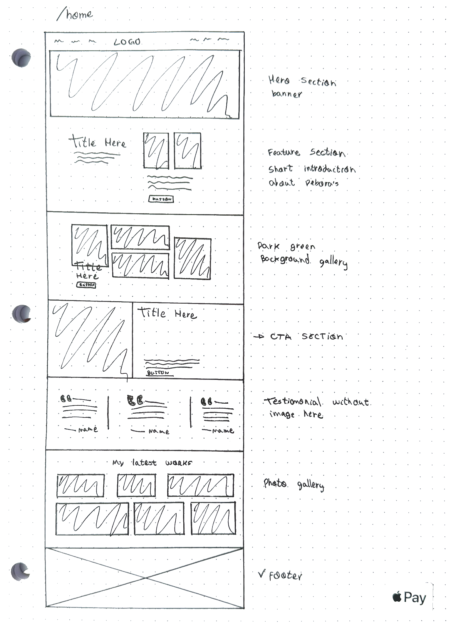
Once the structure and copy were approved, the project moved into low‑fidelity wireframes to explore layout, hierarchy, and flow without getting stuck on visuals too early. These explorations started on paper and then evolved into digital wireframes, which were refined into a high‑fidelity prototype built directly in Framer, combining UX best practices with Debora’s brand aesthetic so the final experience matched both her personality and her business goals.
Step Five
Design System and Components
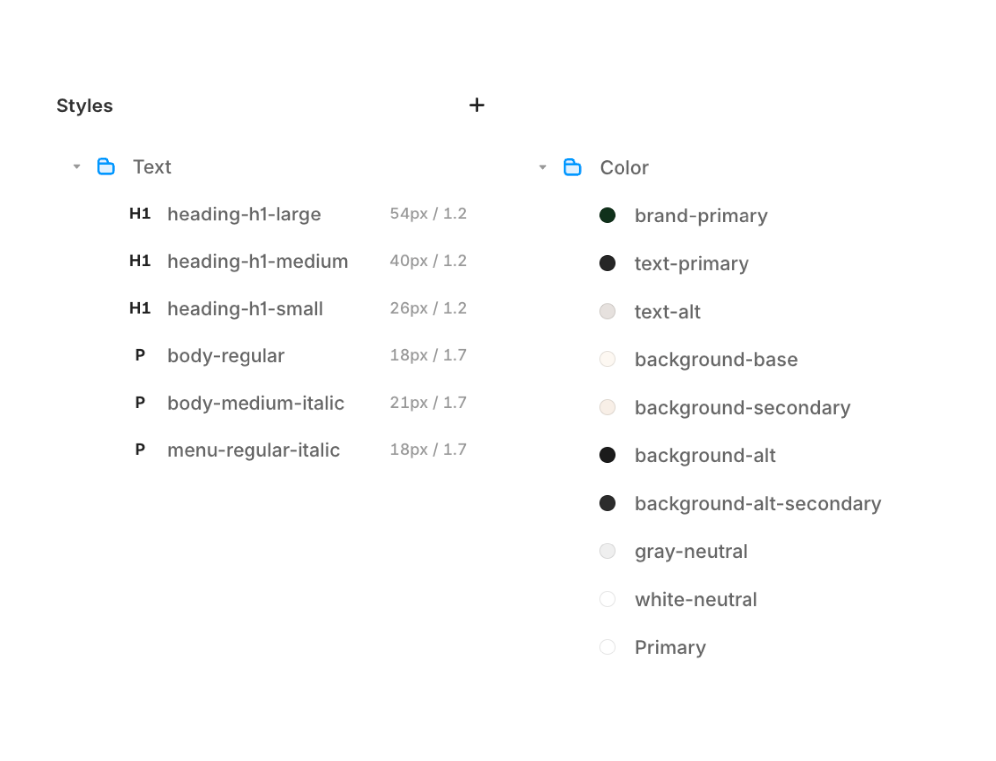
Before refining layouts, I set up a small design system in Framer so Debora’s website could scale consistently over time. The project uses named text styles for headings and body copy (for example, heading‑h1‑large, heading‑h1‑medium, body‑regular, body‑medium‑italic) and a shared color palette with tokens like brand‑primary, text‑primary, background‑base, and background‑alt. This structure keeps typography and colors centralized, making it easier to apply changes across pages with minimal effort.
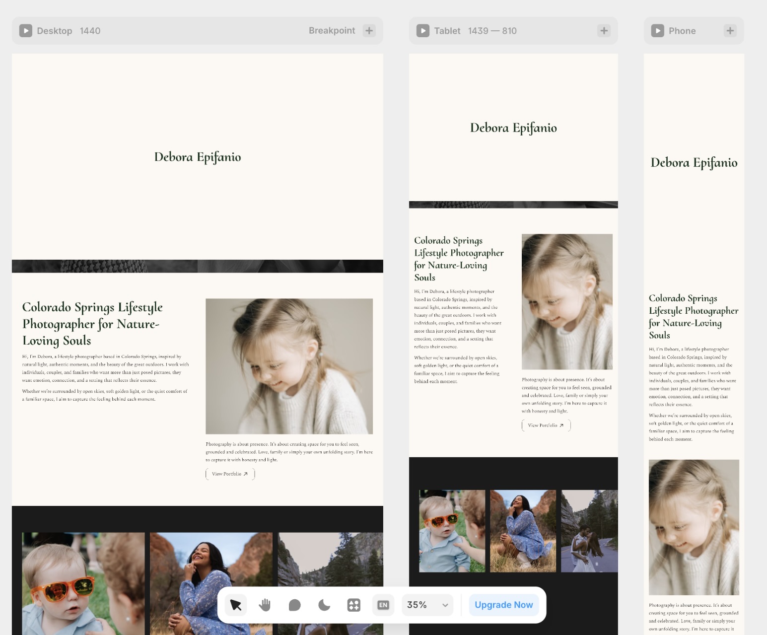
On top of these tokens, I created reusable components for key interface elements, including buttons (default, dark, hover, pressed states), navigation, and footer. Each component was built with responsive behavior in mind and configured to work with the global styles, so updates to the system automatically cascade into the live pages. This setup reduced friction during development and ensures that future iterations of Debora’s site stay visually coherent without starting from scratch.
Navigation
As the prototypes evolved, I decided to build the navigation system from scratch instead of relying on Framer’s pre‑made navbar, so I could understand how each piece behaved across breakpoints and pages. Working this way exposed some limitations in the default settings for complex components, but it also forced me to think carefully about structure, states, and scroll behavior, which will make future projects faster to set up.
Beyond layout, this work reinforced how important componentization is for real‑world web interfaces: the navbar, footer, and repeated call‑to‑action blocks were all converted into reusable components that inherit global styles and adapt responsively, so updates can be made once and reflected across the entire site with minimal effort.
Step Six
Testing and validation
After the structure, visuals, and copy were approved with Debora, I ran a final round of checks focusing on clarity, performance, and basic usability. Each page was reviewed to ensure the messaging was easy to follow, CTAs were visible and consistent, and the site behaved as expected across devices, with forms, navigation, and loading times all working properly before publishing. In addition, I asked a third person to review the live site with fresh eyes, since spending many hours on the same project can make it harder to spot clarity issues or small usability problems.
What I learned
This was my first full project in Framer, and the learning curve felt surprisingly smooth once the document was structured with clear text styles, color tokens, and components. Coming from years of building sites in WordPress with tools like Elementor Pro, this experience made it clear that Framer is much stronger for fast layout and visual consistency, but still more limited when it comes to advanced micro‑interactions.
While experimenting with a horizontally scrollable gallery on the homepage, I spent several hours combining tutorials with my own tests to reach the desired behavior, which pushed me to question when it is worth building complex interactions from scratch versus relying on existing patterns. That reflection led me to explore plugins and pre‑built libraries more intentionally, using them to gain speed while still customizing what mattered most to the visual language of the site.
The biggest takeaway from this project is the value of preparing a small design system before jumping into pages: defining typography, colors, components, and states early on makes maintenance easier and keeps the experience coherent as the site grows. If this project were starting today, the first step would be to invest even more in those foundations, because they turned out to be the main lever for working faster and making better decisions later in the process.
Feel free to connect with me on LinkedIn or drop me an email.
I’m always open to new opportunities and conversations.
Copyright © 2026 Rafael Vaz